Table of Content
A daily chart is a graphical representation of a stock price movements during a single trading day. A daily chart can be in the form of a bar, candlestick, or line chart. One daily chart, in conjunction with other daily charts, can comprehensively show the price action of a stock over a specified period. Daily charts serve as the main tool used by traders for performing technical analysis.
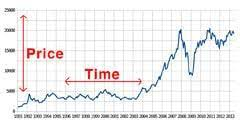
Price charts can be customised. This implies that a chart can represent a minute, an hour, a week, a month, and so on.
A line chart is a graph that has the stock price or trading volume information on the vertical (y-axis) and the period on the horizontal (x-axis). The stock price used for creating a line chart is usually the closing price. The closing price of multiple dates is joined to represent the entire information in a line. Hence, the name line chart.
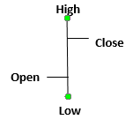
A bar chart is similar to a line chart. Each marking on a bar chart is in the form of a vertical line with two horizontal lines protruding out of it. The top end of each vertical line represents the highest price the stock reached during a day while the bottom point signifies the lowest price. The horizontal line to the left signifies the price at which the stock opened, while the one on the right signifies the closing price.
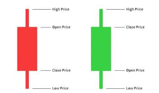
The most popular daily chart used by traders is the candlestick chart. Candlestick charts can easily reflect basic information such as the opening price, closing price, as well as the day’s low and high prices.
A candle consists of two parts – the body and the wicks. The tip of the upper end (upper wick) signifies the day’s highest trading price. The tip of the lower end represents the lowest trading price for the day. The block (called the body), represents the day’s opening and closing price.
The price that is higher between the opening and closing price is at the top, while the price that is lower of the two is at the bottom of the body. In a green/ white candle, the upper body represents the opening price, while in a red/ black body the upper body represents the closing price.
Charts with multiple trading sessions, i.e., charts that display a series of daily candlesticks spanning a long time are more commonly used.
For traders, daily charts are the primary source of information to identify profitable trading opportunities. They often include daily charts in their trading setups that span multiple time frames. For example, traders may use two monitors displaying hourly trades and trades over the past several days to decide on the best way forward with their stock investments.
Ans: A weekly chart shows the high, low, open, and close for the entire week and not the day-by-day stock movement within the week.
Ans: A daily chart represents a stock’s movement for the entire day in a single candle. In an intraday chart, a single candle shows the movement of stock for a specified timeframe (10 minutes, 15 minutes, 1 hour, etc.).
![]() IIFL Customer Care Number
IIFL Customer Care Number
(Gold/NCD/NBFC/Insurance/NPS)
1860-267-3000 / 7039-050-000
![]() IIFL Capital Services Support WhatsApp Number
IIFL Capital Services Support WhatsApp Number
+91 9892691696
Download The App Now
Follow us on
2026, IIFL Capital Services Ltd. All Rights Reserved
IIFL Capital Services Limited - Stock Broker SEBI Regn. No: INZ000164132, PMS SEBI Regn. No: INP000002213,IA SEBI Regn. No: INA000000623, SEBI RA Regn. No: INH000000248, DP SEBI Reg. No. IN-DP-185-2016, BSE Enlistment Number (RA): 5016
ARN NO : 47791 (AMFI Registered Mutual Fund & Specialized Investment Fund Distributor), PFRDA Reg. No. PoP 20092018

This Certificate Demonstrates That IIFL As An Organization Has Defined And Put In Place Best-Practice Information Security Processes.